By The Pound Redesign
and
Susan Kare Inspiration
SI 616
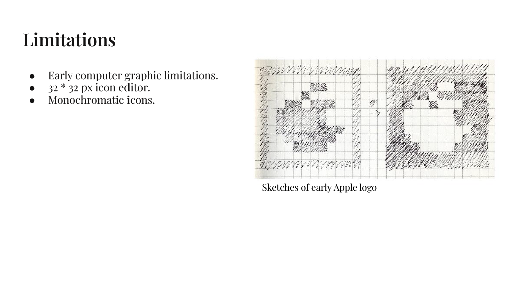
Susan Kare is a well known graphic designer most notable for her work with Macintosh and designing many of the icons we see today. Below is the presentation of my group and I on Susan Kare and her early work. We were tasked to redesign a local Ann Arbor business using inspiration from Susan Kare’s work. Below the slideshow you can take a look at our redesign and its reasoning.


-
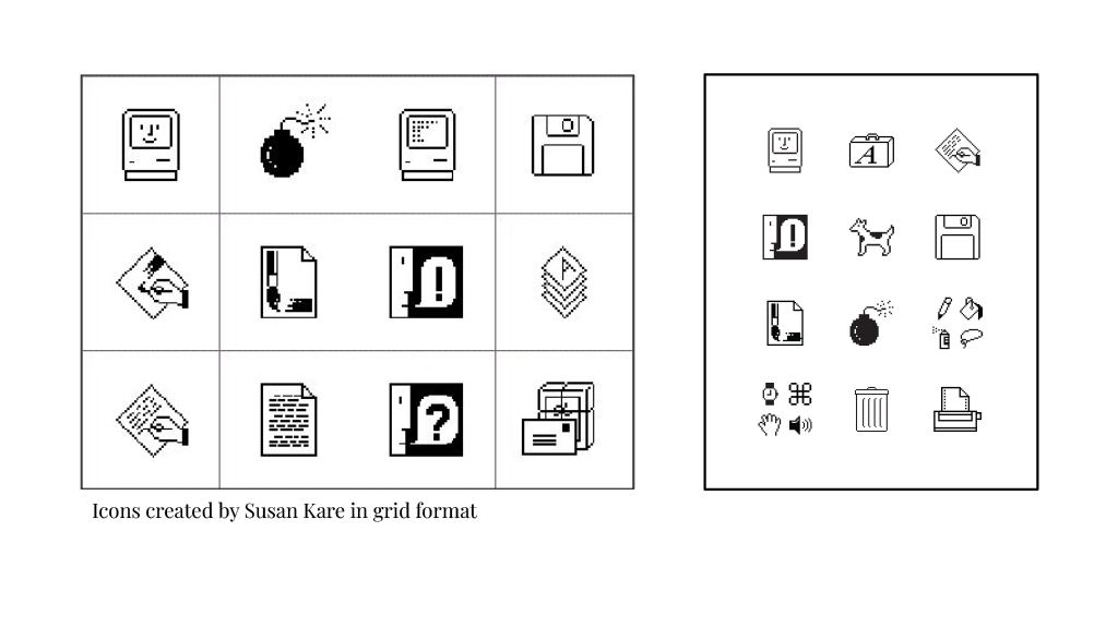
Simplicity: Kare's style is simple and minimalistic, emphasizing clear visual communication.
Playfulness: Kare adds playfulness to her designs, often incorporating anthropomorphic elements, making digital interfaces engaging and friendly.
Relatability: Icons and symbols should cater to user expectations and familiarity.
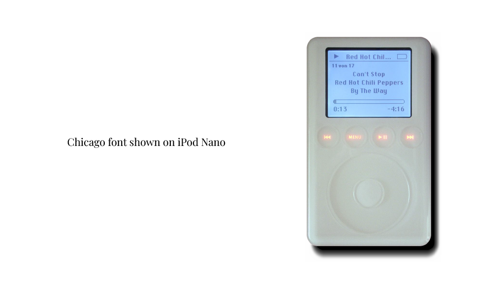
Typography: Kare designed multiple typefaces with bold and legibility in mind when used on a digital system.
Use of Colors: Due to working on older technologies Kare used high contrasting colors such as black and white for clear visuals and effective communication. Later on the use of bright vibrant colors were added.
Pixel Art: Kare’s renowned for pixel art, using small dots to create detailed images, popular for its nostalgic appeal.
Semiotics: Kare set the foundation for Macintosh and future digital applications through her visual communication with icons, symbols, and indexes.
Metaphors: Kare often uses metaphorical imagery in her designs to represent abstract concepts.
User-Centered Design: Her design philosophy revolves around putting the user's needs and understanding first. Icons and symbols should cater to user expectations and familiarity.
-
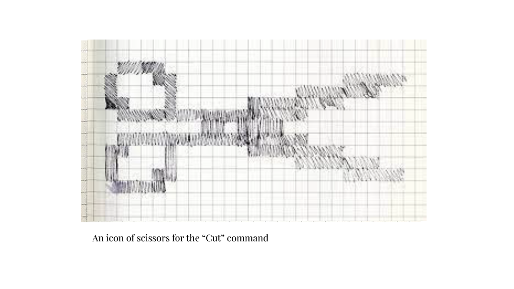
1. Fonts must be legible on low resolution screens.
2. Grids and consciousness of space limited by 32x32 pixels.
3. Simple and bold usage of monochromatic color palette.
4. Simplify complex actions or concepts into easily recognizable symbols.
-
Use Metaphors Wisely
"We tried many, many things that were trying to be metaphors for control- I think we tried a badge- and they all seemed too harsh, and nothing seemed to work. So I said, 'Let's try something abstract.'"
Work Within Constraints
“Understand the constraints of whatever project it is before you start and then you can created with those constraints.”
“I tried not to use words, and not to use puns, because they don't translate.”
“I tried not to use words, and not to use puns, because they don't translate.”
Iteration is Key
“None of this is an exact science, so whenever we work on project we try to have a range of solutions and see what looks right”
Simple and Recognizable
“Simple images can be more inclusive,” she said. Look at traffic signs: “There’s a reason the silhouettes of kids in a school crossing sign don’t have plaid lunch boxes and superhero backpacks, even though it’s not because of technology limitations,” she said. “Those would be extraneous details.”
-
Goal 1: Create a more modern style design to attract younger generation to shop at By The Pound
Goal 2: Promote sustainability through design concept.
Goal 3: Incorporate a bit of humor
-
Sketches
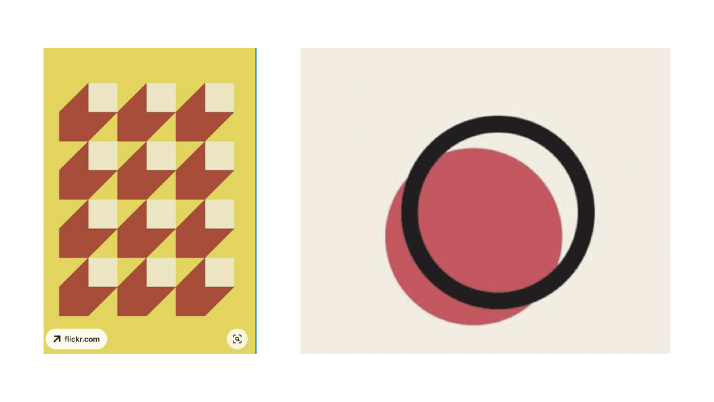
Moodboards
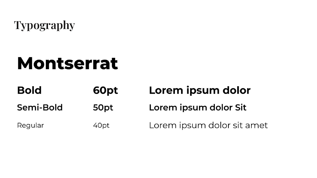
Typography
Logo Variations
Color Palettes
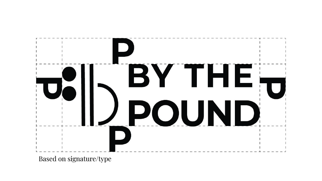
Logo Mandatory Free Space
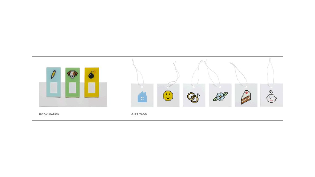
Mockups
